Button Design
This page describes the edit modes that are selected from the side bar of the Editor which
allow customisation and positioning of buttons.
Move
In this mode the buttons can be selected and dragged across the remote to their desired location. Dragging a button a significant amount in another edit mode will also cause the move mode to become active.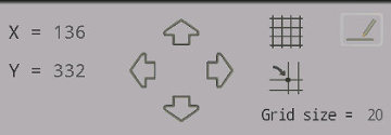
Move Mode Controls
The nudge arrows in the move controls will nudge the button 1 in the direction selected. The distance a nudge will make to the button position will depend on the width and height of the remote. The center X and Y position of the selected button is shown to the left of nudge arrows.
There are two grid buttons, the top button will toggle the grid on and off. The bottom grid button will toggle grid snap on and off. When grid snap is on, the button center will snap to the nearest grid position. The grid size is shown below the grid buttons and can be edited with the edit button located in the move mode controls.
Grid lines are drawn from the center of the remote outwards. Grid sizes are not saved in remote files. However each remote on your device can have its own grid size which is stored in preferences so you don't need to set them each time.
Size
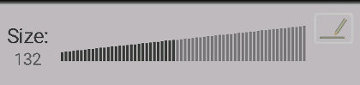
Size Control
In this mode, the button size can be set, by dragging of the size control that appears beneath the remote. Alternatively tap on the edit button and enter the size manually. Note that the minimum allowable size for the button is 1. The maximum size is the remote width or remote height (which every is smallest). Note that a button size includes some empty space around it. The yellow square that appears around the selected button is the size that is set with this control.
Size is not in fixed units such as pixels, but based on the size of the remote that has been defined. For example if the remote was given a width of 500, a button of size 50 would take up 10% of the width of the remote, whereas if the width of the remote was set to 100, then a button of size 50 would take up half the width of the remote.
Shape
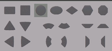
Shape Options
Select from one of 19 shapes that appear below the remote to assign that shape to the button. The selected shape is highlighted in the selection by a darker background. If no button is selected then no shape can be selected and the control is grayed out.
Color
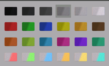
Color Options
Select from one of 24 color filters for the button. The top row offers varying shades of grey. The following two rows offers some colors and the final row has white buttons that light up with a color when pressed. The color options can only be selected if a button is currently selected. First select a button, then select its color. The color options show two shades of color, the left side being the unpressed button color, and the right side of the diagonal being the color of the button when it is pressed.
Icon
Select from one of 31 icons for the button, or leave the button with no icon (select the blank icon at the top left). Make sure a button is first selected, then select the preferred icon for that button.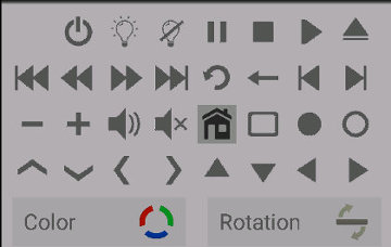
Icon Options
The color and rotation buttons allow the icon color to be modified and he icon rotated about the button center.
Icon Color
Tapping on the color button will bring up a color picker made with three arcs where the amount of red, green and blue in the color can be set. Each of the red, green and blue values can range from 0 to 255 and are adjusted by dragging the corresponding cursors around the arc. The effect of adding more or less of each color can be seen in the color of the arcs.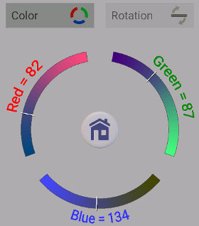
Icon Color Picker
Icon Rotation
Tapping on the rotation button will bring up the icon rotation selector. The cursor on the ring shows the current rotation. Drag the cursor around the arc to get the desired icon rotation. Rotation is incremented in 1 degree steps. In the center of the rotation ring is a button indicating the rotation of the icon.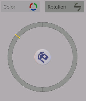
Icon Rotation Selector
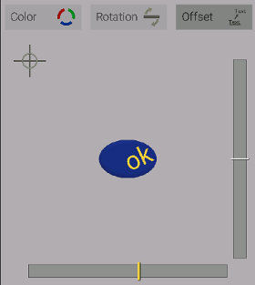
Text
The text edit mode allows some text to be placed onto a button in addition to any icon it may have. The text does not have to be positioned centrally on the button, and can even be moved outside the button with the offset setting.The text can be edited by tapping the edit button to the right of the text.
The size of the text is adjusted by dragging the size control in the same way that button size is adjusted and also constrained to the same limits (see above).
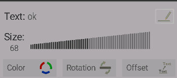
Text Options
The text color can be set by tapping on the color button and selecting the red, green and blue components of the color from the arcs that appear in the same way that icon color is selected (see above).
The text rotation, also uses the same control as for the icon rotation (see above), but this time affecting the rotation of the text.
Text Offset
Tapping on the offset button will bring up the text offset selector.Dragging the cursors on either the horizontal or vertical bars will move the text in those directions.
Tapping on the cross hair icon (top left) will center the text again.
Text Offset Selector
The text offset can also be set, as with all the text settings, from the same edit button that is used to modify the text.